Designing A Website: Your Checklist & Helpful Info to improve Web Design
When you make the crucial step of introducing your Web Design Company to the online world, you want to stand out – and in a positive way. It is a matter of creating a captivating and stylish Web Design that will also serve its purpose.
Designing a website is no small feat. Get ready to spend some really long time inventing, creating and meticulously tuning every little detail, doing and redoing it all over and over again and again.
Fortunately, we live in a great time when access to all sorts of information is easy as never before. You can master virtually any skill, not even having to leave your home. With all the tools and professional recommendations you can find online, everything is possible. Creating a website is no exclusion: however time-consuming it is, it truly is a fun process.
Before you dive into the deep waters of fear and lack of self-confidence, we tell you what: you can do it. And don’t blame us for throwing cliches; if you follow this checklist, you’ll be surprised how much less complicated it turns out to be.
Some advice before we begin
- Attention all perfectionists! Your website doesn’t have to be state-of-the-art-type from the very beginning. Start with something simply nice; you’ll develop it into a second-to-nothing masterpiece later on.
- You make an appearance – introduce yourself right. You’re new to the public. Let them know what you have to offer and how exceptional your service is. And, continuing with this line,
- Be memorable for a reason – visual recognition will follow. All the tricks in the world won’t make up for a bad reputation. The quality of your service will be your best advertiser.
Contents
A brief glossary
1. Plan what you want
2. Choose a platform
3. Select a hosting provider
4. Create a domain name
5. Brand your site
6. Choose a theme
7. Create the layout
8. Add content
9. Last-minute check
Tools & sources
What is what
First of all, we need to agree on the notions you’ll come across in this post.
Design is a general term. Here, we’ll use it to describe a plan from the visual standpoint; an insanely detailed sketch, as it were.
Web design is the process of creating the look of a website. It involves more than what you see and touches UX as well.
UX, or user experience – this is what users feel when being on a website. How convenient all features are, whether or not it’s easy to find the information they need – that sort of stuff.
UI, which you commonly meet together with the previous one, is what you think first when you hear “web design”. User interface is the visual component of a website.
1. Plan
No matter how much you wish to get down to the active part of the process, you absolutely have to go through this stage. Having a well-thought-through plan of what to do is a foundation for all further work.
You might have done some of the work from this stage when developing your business idea. If you haven’t yet, it is just about time.
Reasons & purpose
The website you’re creating is your way of communicating your idea. An online shoe store and a blog of a rising star of journalism are two completely different stories.
Think of what you’re going to do business-wise. Your scope of activity determines the type of website you should have.
There are seven main types of websites categorized according to their purpose.
- Portfolio
- Business
- Landing
- Ecommerce
- Blog
- Entertainment
- Social media
To be fair, the boundaries between types are rather vague. Depending on what you’re planning to do, you can choose either of those types or create something in between. This classification is not the one and only; types of websites is a big topic to cover. This is a simplified list for you to locate your general area.
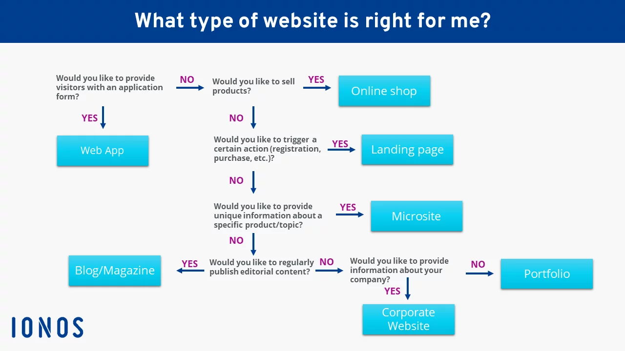
To find out what kind would be the best fit, answer these questions:
What am I seeking to achieve?
What will I offer people?
Identifying your perfect type of website can be tough. You can use this awesome chart with the most common types of websites:
Target audience
This is closely related to the purpose of your website. Your audience is, in a way, the reason you go online. To create an impressive design, you need to know who you’ll be impressing with it.
Identify your potential visitors’ most characteristic features. Figure out:
- their demographics;
- their problems and needs;
- the kind of sites they spend the most time online
…and so on: the list can be as long as you are specific with your planning.
Once you specified that for yourself, think of what benefits you can offer them. It is a more effective practice to appeal to feelings and emotions rather than logical thinking. Features tell, benefits sell, as the saying goes. But don’t get it wrong: you need to have a logical base under your product or service, and telling about it is a must. It’s just not what visitors will first pay attention to, even though subconsciously.
It is essential to always keep in mind with whom you’re communicating. You should build everything on the website around their potential likes and needs. Analyzing your audience will be helping you long after you launched your first website. If you keep up with the changing profile of your target audience, your income will be growing. L’Oreal Canada almost doubled their anticipated revenue by properly working on targeting. This is their suggested cycle of measures:
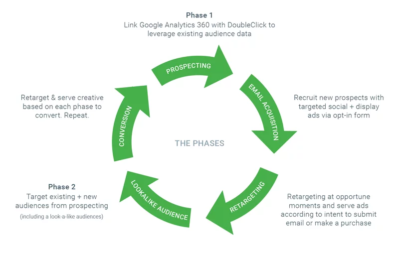
Google Analytics is a powerful tool when it comes to marketing. When you get your site working in full swing, you should consider using it for targeting your audience and assessing the data related to it.
Set goals
Your website must be helping you achieve something. What is it you build it for?
Though it may seem similar to purpose, these two are not to be confused. The small but significant discrepancy is in the object: while the purpose implies the benefit of clients, your goals reflect your desired outcome. Make sure you know where you’re going.
Are you trying to sell online?
Is there some other way you plan to monetize your website?
What would you like to get from it?
Find answers to that and always look back on goals whatever you do.
Find references
It helps a lot to look at the examples of what already exists. Not only will it help develop your idea; you will know what to avoid using so as not to repeat the others. You don’t have to search for references only in your field: if there are some gorgeous-looking websites from some other type of business, you can scoop up some ideas from them, too.
Search for good examples of what you want to strive for. However, you should distinguish between ideal and reasonable. If your reference is Apple, Adidas or whichever other big player on the market, keep in mind that their website most likely gets much more funding.
Talking of that, you should also decide how much you can afford to invest in your website. And it’s not only about money; time is your most valuable asset. If you can’t work on it for more than a certain amount of time, it’s totally understandable.
2. Platform
Now that you are ready to start, choose the building tool. Among the most well-known are WordPress and Wix.
Wix offers a free website builder, but it comes with significant restrictions (like you can’t have a custom domain name but will have Wix advertising on your site). A great advantage of this page builder is that it is easier to use for beginners.
WordPress is available completely for free. You will need your own hosting, but we’ll get to that part in a moment.
We prefer WordPress for its great customizability. An abundance of templates and more than 50,000 open-source plugins (not even counting the premium ones) together with a customizer will let you work wonders with your website.
Out of all websites with identifiable CMS, almost 60% are on WordPress, according to W3Tech research.
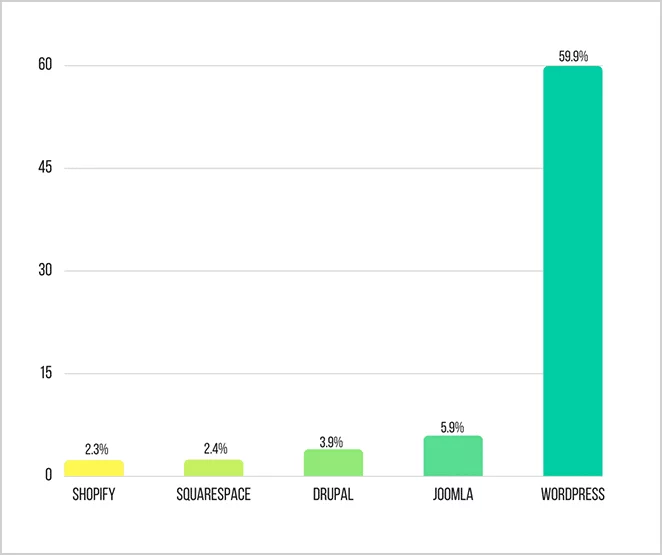
We don’t mean to say you’re limited to the two options we’ve named. There are many others like those you can see on the graph. We just suggest you go for the more well-known platforms. If you’re a beginner, it will just make your life easier.
Since WordPress is so incredibly popular, you will be able to quickly find solutions for any problems or questions that may appear, and you could always get our help with your site. We’ll be glad to work a way out of any problem with your WordPress site, just let us know.
3. Hosting
A hosting provider is a company that provides you a server for your website. It is a home for your website to live.
If you choose WordPress, you can go for their hosting service (you’re looking for WordPress.com in that case). But they also provide the opportunity for self-hosting*, meaning that you can either host your site yourself or select a company of your choice.
* We really respect the decision to go self-hosted, but it can be a debatable decision if you plan on growing and expanding in terms of traffic, service and so on. You get full control of what’s going on, but you also get a huge responsibility of maintaining and fixing all server-side issues by yourself.
Though it seems tempting to choose a discount hosting plan (especially in the very beginning when bandwidth and hardware capacity haven’t become a matter of concern yet), stay away from suspiciously cheap options. Better hosting is only a few dollars more to the cost, but it is priceless from the perspective standpoint. They provide better service and support, you get less pain in the neck with various breaks, lags and whatnot – you truly get what you pay for.
Struggling to make up your mind on which one to choose? Check out the detailed comparison of a few leaders in that market.
4. Domain name
Your domain name doesn’t affect SEO, but it’s better to make it recognizable. If your main URL is too long or doesn’t look the least familiar, it becomes harder for visitors to remember your website. Putting your company name (if you are a business) is a good idea unless it’s not a 10-word sentence (which it hopefully isn’t).
If you’d rather save some creative energy for later, use online domain name generators – they will also help you check if a name is available or not.
They offer various options to the taste of the pickiest. Select one from the category you like the most – there are so many!
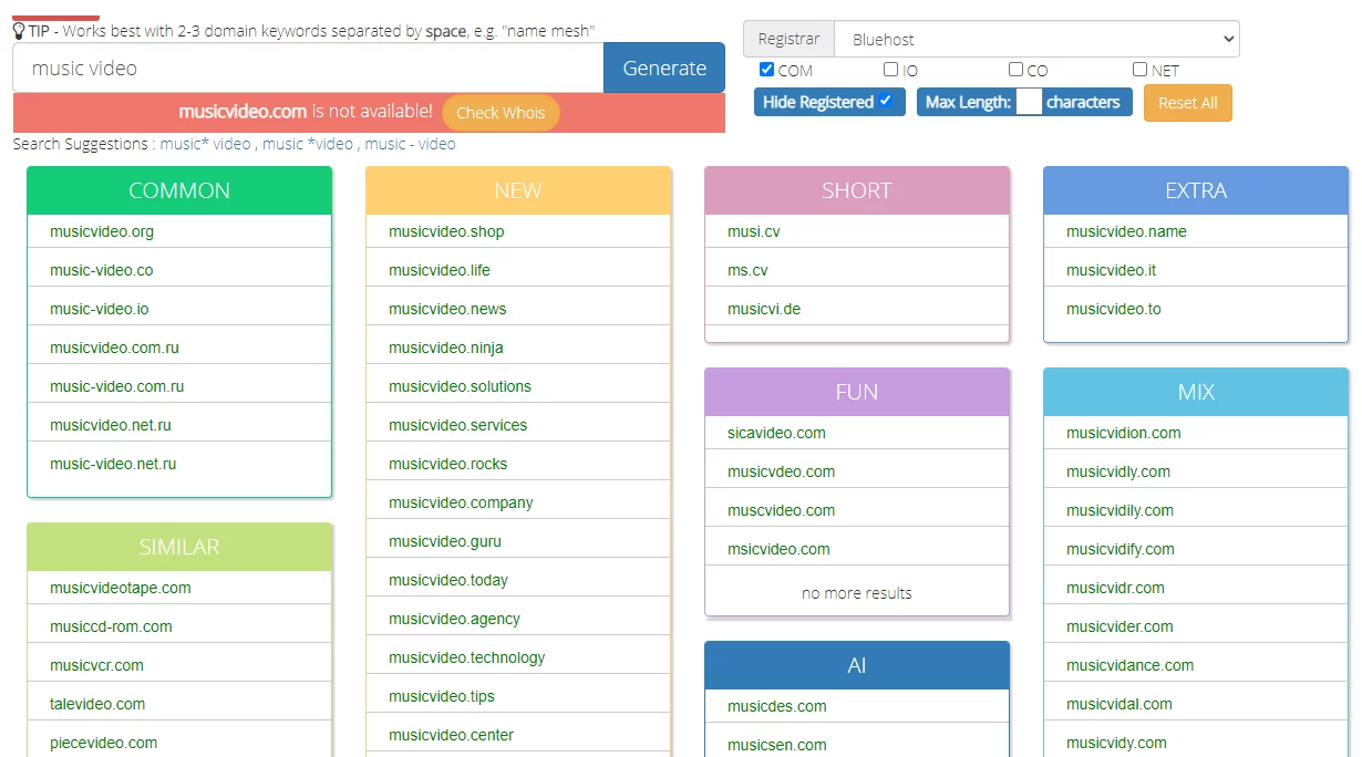
And the list goes on for much longer than would be reasonable to show on the screenshot.
They provide you with an even larger selection of options, most of which are indeed lean, as the tool name claims. Use them for inspiration or take any of the names offered – it’s up to you.
Other URLs from your site do have more impact on SEO. They should include the main keyword from the text on the page. Don’t pack it too tight with words though; it won’t do any good to repeat the same keyword or to make it overly long. Keep it simple.
And, just in general, when permalinks make no sense, it can be slightly off-putting.
WordPress has several options for how to put together a permalink. On your dashboard it is under the Settings section:
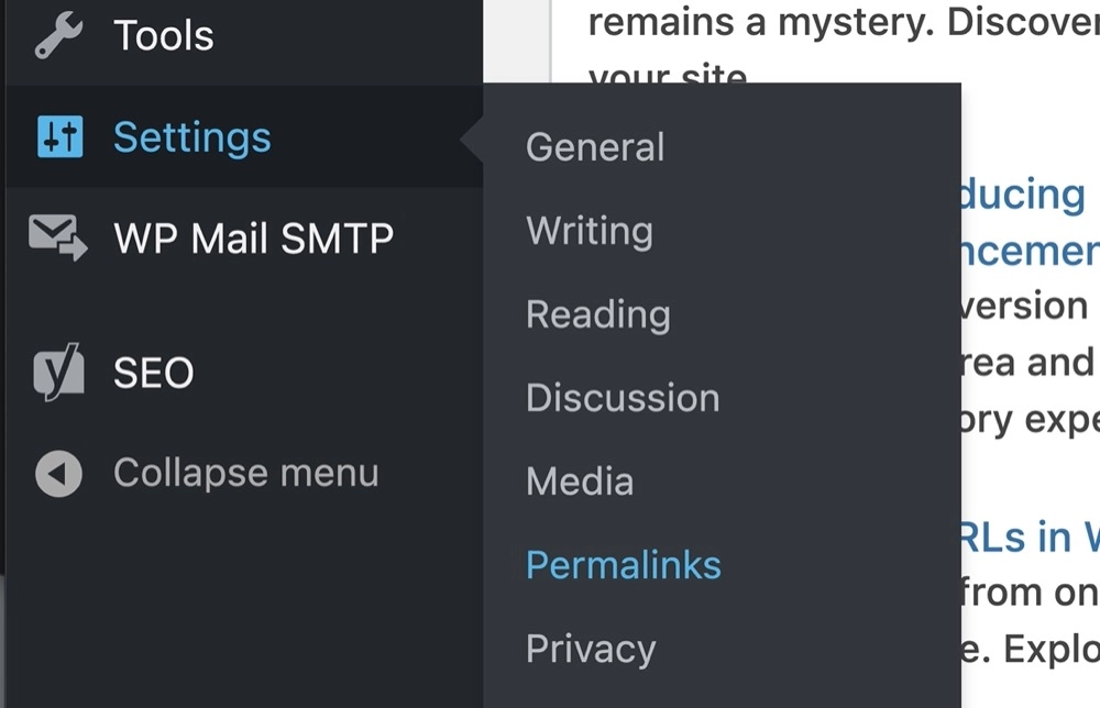
Post name would be the way to go.
5. Site branding
Building your brand is a long story of creativity, effort, analytical approach and other serious things – a topic for a bachelor’s degree program rather than a post. But for a start, it’ll suffice to understand the basics, and the rest will follow as you grow.
A brand in the general sense is the image and the message your company (or service or yourself) transmits to people. You need to think of all sorts of details, create a signature style that will show in your every action. And the first thing you have likely thought of in that regard is a logo.
Logo
Developing a catchy logo means a lot to any business, even if it’s a non-profit type. It is by your logo that people will judge you at first.
Here, you once again have an opportunity to get a hand from our dear friend – modern software. Multiple online tools are all yours:
A great free tool that will generate a logo based on your company type, a slogan (if you have one) and some of your preferences in colors and icons. They offer a lot of reference options to understand what you like and create simple and stylish logos.
Another sweet tool that is free to use, downloading source vector files (SVG) will cost around $20. Their logos are at least as pretty as the ones from Looka (or maybe even prettier), so, it’s nice to try many tools to get the most stunning logo.
This one is different from the previous in a fun way. If both first two were generators, LogoMakr is more of a designer tool: it allows customization from your side providing a sort of simple graphic editor.
As you probably know, a logo is not the only thing that represents a brand. It is still a highly essential item of your brandbook, but it is far from being the only one. From the broad range of things to consider, concentrate on color scheme and fonts
If you wonder why we’ve omitted the slogan, here’s what we think. A slogan is a good thing, but today it is optional to have one or not. For now, you can do without it if you have none. Also, we can’t recommend you any tools or techniques for devising a slogan since only you can find the most efficient way to fit your message in a few short words.
Color scheme
Working out your main color palette is another significant step in your branding. The colors associated with you will be about as memorable as the logo – choose thoughtfully and carefully.
One (but not the only) necessary fact for picking your colors is that colors affect us on an emotional level. In our minds, they are related to certain feelings and emotions, and you can’t ignore it.
It would be fair to say this one is probably the most popular and beloved service for this purpose. They show a quick tutorial of the palette generator, and off it goes: you get sets of five colors each time you hit space. Lock the ones you like on the screen and continue with the random picks of the program.
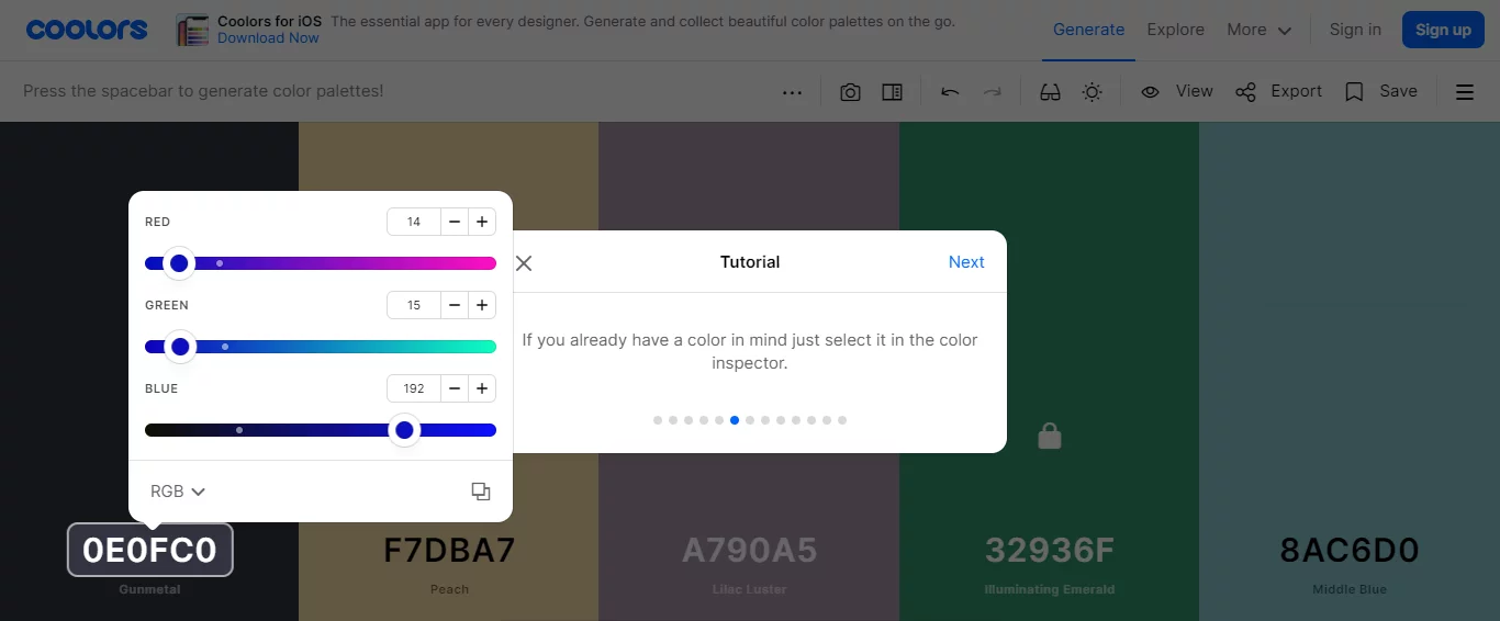
This tool works with images. You upload up to 20 pictures you like, and the generator will provide you some options of color palettes that suit your images.
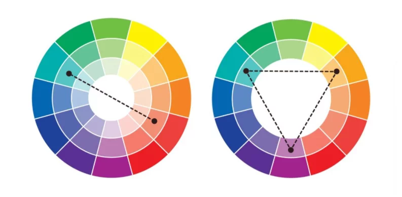
This is not an AI or some software, but it is a fantastic breakdown of the general principles of combining colors. It is a really educational article, you’ll love it!
Fonts
To not go in depth and detail too much, fonts reflect the mood and the tone of what you write. It means that they must correspond with your message and your image. Simply put, if you’re some serious IT business, it would look inappropriate if you use comic sans (actually, we would hardly be able to name any type that wouldn’t).
The fonts that are considered the trendiest now are sans serif. They complement the contemporary fashion of sleek and streamlined interfaces with little to no fancy ornaments. This is not carved in stone as a must, though; maybe your style will require something classy and more traditional.
In case you doubt that fonts matter, note how the inner voice in your head changes as it reads these simple words:
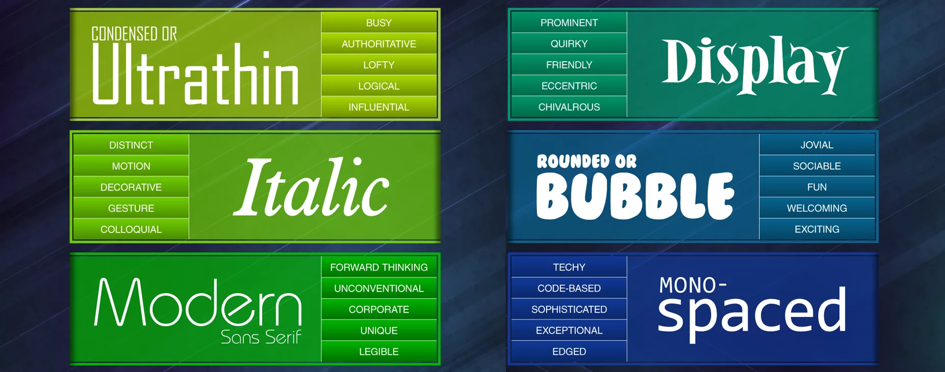
Alright, this was not so subtle as the description next to each font explicitly states what mood it creates. But you get the idea. By the way, the original image we found in this cool blog has many other types of fonts with their key properties and associated emotions. You can check out their Ten commandments of typography as well – a useful source to get to grips with the basic rules of using fonts.
Visuals
This is just another work for the images and icons you will have on your website. Note that we aren’t talking content yet; these visuals are your tools for creating the atmosphere or the vibe if you will.
Whether it be a background for your site or just an illustration for a small element in the corner of the screen, pick a beautiful image for it. You don’t have to (and even shouldn’t) pack all pages with gigantic pictures. Just use the ones that will help you put an emphasis on something or balance out a block of text; keep it reasonable.
Find the ones to your taste among the free stock photos or the paid ones – depending on how much importance you attach to the matter.
A couple of sources of free stock images we like:
- Pixabay – lets you search images by tags or surf the ones displayed on the homepage;
- Unsplash – similar to the previous source but offers premium stock photos along with the free ones;
- Canva – they provide a list of 74 image sources of their choice.
Free SVG icons sources are in many ways similar to each other, so, for the convenience of search:
6. Theme
A theme is another way to call a template. WordPress provides them as a base for your website from the front-end standpoint. Among other things, they have templates for the basic pages, which is some solid help in building a website.
You may come across the opinion that choosing a theme should go before the logo. Well, there’s no single correct opinion on the matter, but here’s our reasoning. Most likely, by the time you started thinking of getting a website, you already had something in mind for your logo and style. Those things come to mind more naturally. Your theme has to work well with your style, and that’s why we suggest you get it after you’re done inventing your basic distinctive features. However, it is totally up to you, and if you feel like building everything will be easier with a theme already in place – do it! Your way is the right way.
On WordPress, the selection of themes is beyond describable. Anything you can think of you can find.

And whatever you can’t you can create by customizing your theme. Themes have a lot of pre-built stuff in them, but if you want to stand out from the crowd, you want to make your changes to the template. Let it be your platform for creativity.
The greatest benefit you get from the theme is it ensures the consistency of your style throughout the website. The website needs to look unified in all its aspects – it is highly important.
Theme previews have the type of content you would often find in that kind of layout, which also helps make a decision.
Talking of that, we come to the next important step in the process.
7. Layout
As you were scanning through all theme options, you must have noticed their suggested location of sidebars, the size of headers, the way the content is arranged on the page. All those things constitute the layout of your site.
When working on your site layout, the most crucial thing you must keep in mind is how user-friendly you make it. Now, a bit more on that.
UI/UX
Remember how we mentioned UI and UX at the beginning of the post? This is the stage where you should take them the most seriously.
All those fancy adjectives you might have heard in the context of user interfaces: streamlined, intuitive, flexible and aesthetic, elegant and minimalistic; the truth is… they all are meaningful. Right, there will be no unexpected revelation of some think-outside-the-box concept. Leaving aside the pompous way everyone is calling their program interfaces, the idea behind those words is right. You must have your website as convenient as possible and as attractive as no other out there.
Some say that a good interface is the one people don’t really notice. We can agree with that in a way. Mostly, when users pay specific attention to an element of the interface (if it’s not a picture that is intended to be eye-catching), it is something that bothers them. Otherwise, when everything runs smoothly and seamlessly, they would take it for granted.
So, the UI of your website is the way it looks. All the colors and pictures, the way you locate text blocks and illustrations – the pretty stuff. We can call it the visual layout.
Now, apart from the drop-dead-gorgeous look, we still keep in mind the functionality of your site, right? Your site interface is to provide your users an experience as seamless as possible. ‘What does it mean, though?’ you may wonder. Well, let’s break it down into the most essential guidelines.
- Everything on your website should lead to performing the target action (i.e., subscribe, buy, sign up etc.).
- However, don’t be phony – you’ll scare people off.
- Meet the expectations: your interface must be intuitive. The less cognitive effort users put in finding their way, the better they feel interacting with your website.
- Personalize: introduce yourself and connect with the users.
- Plan your pages with real content. It is far more effective than pasting Lorem Ipsum.
- Prioritize functionality over appearance – everything on your site has to operate properly and be clear enough without lengthy tutorials.
- Page speed matters. Work on optimizing your content and the processes behind the scene. If a page loads for too long, users will likely abandon it. Our attention is far from being persistent:+
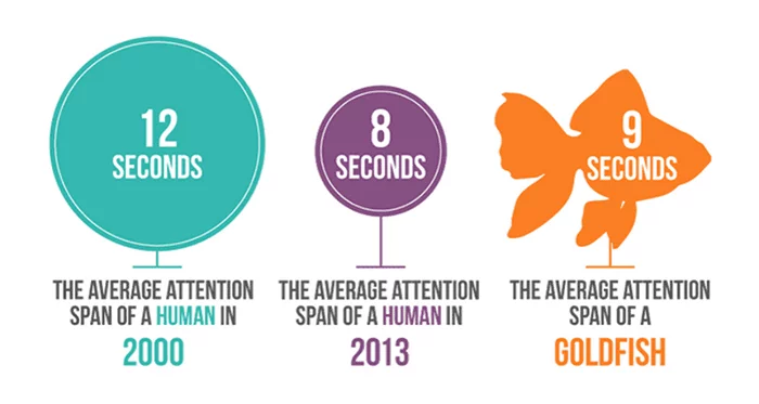
We’re all conditioned to the certain rules of UX. Your site’s logo and title should lead to the homepage; you need to enliven the buttons with effects triggered by hovering over them; many things, to be honest. Get familiar with more laws of UX – and keep on improving your website.
Before moving on to the next step, last but not least: test your website! And you have to do it with actual users, not by yourself if you want to ensure their best experience.
Above-page-level layout
This is another way to call your website’s pages and their interconnections. Most likely, your website will contain more than one page unless you’re creating a landing (other types are hardly ever one-page). So, if your site is not that kind of rare beast, it’s time to figure out which pages you need.
Coming back to the UX, it must be logical and it must provide at least the anticipated minimum. That would include:
- Homepage (obviously);
- About and Contacts pages – they help connect with the visitors;
- Portfolio (if applicable);
- A page on your main offer to the visitors (order, sign up etc.)
It can be more or less, depending on your particular case, but that’s the most common structure. Most WordPress themes have templates for such pages.
Your website should be an organized system. Make it all a set of logical sequences – all for the users to feel at ease. Avoid leaving some pages hanging with no way to reach them (other than pasting their URL).
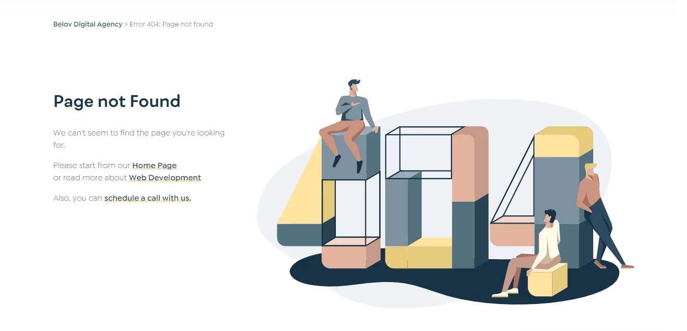
Make sure you take errors into account: a nice 404 page lowers the negativity level associated with getting a ‘Not found’ message.
Page layout
The way you organize the visual and functional components on the screen is what people call page layout. You have some measurable room for your inventive
Before getting to decide on the pattern, take a look at the main rules for organizing your pages:
- The header should include the title and/or the logo of your site, as well as links to the most important pages.
- The footer should contain copyright, site map, contacts and privacy policy.
- The sidebar (if you have one) should help users navigate, not overwhelm them; don’t cram everything in it.
- Those three from above should look the same throughout the website.
Types of page layout
To make a better impression with your website, you need to configure it according to what people like more. You can follow the guidelines based on research and arrange the elements along the lines our vision will go. The most effective and commonly met layout types are the F type and the Zig Zag type.
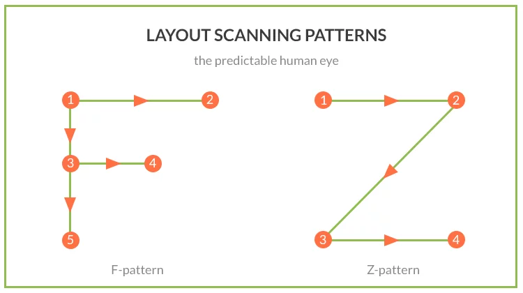
Adobe can tell you more about the rest types and the best way to implement them.
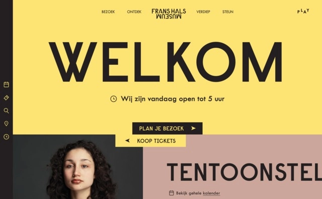
There’s also plenty of inventive ways to juxtapose text and pictures. Styles like big type or full screen mesmerizingly glue your sight to them:
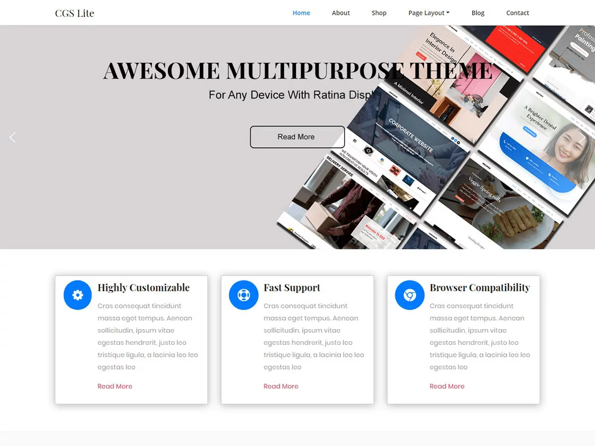
A more formal layout example is the grid structure. It looks great with brief excerpts of blog posts or magazine articles:
8. Content
And here we’ve come to the crux of the matter of creating a website. Content is why users initially came to you and what they will consciously rate.
We’re not going to decide for you what you should and shouldn’t put on your site. We can give you a few recommendations, though.
- First of all, choose logically what will be filling your website. The content has to be understandable and relatable for your target audience. If it helps them somehow or is pleasant in any way, you got it right. And never try to outsmart or mislead your visitors: it is again the matter of meeting the expectations. Clickbaits are no good and always result in sheer disappointment for both visitors and site owners.
- Make it catchy: short and witty phrasing is preferred over long explanations (unless you are a writer or some of the kind).
- Images and videos add a lot to the attractiveness of a page. Our concentration span is too short to focus on plain text for long. Illustrate what you say in versatile ways.
- Talking of the visuals: optimize them. Optimization is the proper practice you should apply to all content on your website; that way, you boost the page speed and thus the UX, too.
- Distribute your content properly. There is above-the-fold and below-the-fold space on your website: one has to catch the eye, another follows up, and both must make sense and be meaningful.
- And make it SEO-friendly. We haven’t mentioned it a lot here because website building now mostly comes SEO-optimized by default (WordPress definitely does). But you’re the one to choose what to post, so, pay attention to tags and keywords.
And having that done, you are a happy owner of a website!
9. General tips
Now, a few words to help you check if your website is ready for launching.
- Ensure responsiveness. Will your site fit in mobile, tablet or desktop screen size? Most website building software wouldn’t let you miss that part, but make sure you have it done.
- Think of SEO. You want your website to be easy to find.
- Find a balance between conformity and being unique. Stand out without going too obviously against the reasonable guidelines.
- Quality matters. And by that, we mean both the quality of what you have on your site and what kind of service you offer.
Summing up
You’ve done a great job. But this work never ends. Keep on improving your site. If, after making it through all the steps, you feel like it could be better, it’s alright. In fact, it’s fantastic because it means you’ve grown professionally since the beginning.
Remember to be lively: get accounts on major social networks and connect with people. It will be a perfect way to advertise for yourself.
Improve your style (we can tell you when), keep up with the trends, and you should be fine.
Useful sources & tools from this post
Targeting
Platforms & hosting
Domain name
Design
Logo
Color palette
Images
Icons
Interface